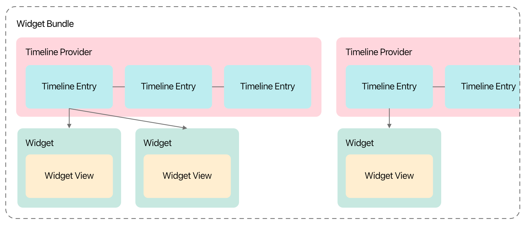
Anatomy of a Widget
12 August 2023 • Development • Swift • SwiftUII have long been a little confused by how widgets work, from a development perspective, in iOS apps. There are a number of moving parts that all have to work together just so to make the widget appear how you want, with the data you want, when you want. This post is my attempt to break it down into each part, in the order they need to be defined so the app still compiles after each step, with my understanding of what they’re for and what they do.
The major caveat here is: I still do not understand widgets, or really know how to build them properly. Nor do I understand interactive widgets that come in with iOS 17. But, hopefully, my knowledge will increase and I can update this post as I learn more! Please do not hesitate to let me know about anything I write here that’s misleading or factually incorrect.
The Timeline Entry
Widgets are a series of static SwiftUI views, rendered on a timeline into the future. When the system reaches the end of the timeline, or at some point determined by your app or widget configuration, the app extension is asked for another timeline to render.
Each item in this timeline is a timeline entry, which is simply a struct conforming to TimelineEntry. This struct needs to hold all the data your widget needs to know in order to render correctly. The date property is mandatory (specified by the TimelineEntry protocol), but all other properties are up to you. For example, a widget that simply renders some text may need a timeline entry such as the following:
struct MyWidgetEntry: TimelineEntry {
    let date: Date
    let text: String
}
The Timeline Provider
This is the part of the widget that is responsible for providing each timeline when iOS asks for one, and needs to be a struct conforming to TimelineProvider. Apple’s documentation is pretty good here. There are three required methods that need to be implemented:
- The
placeholdermethod must return, as quickly as possible, a single timeline entry for use in placeholder views (such as when the user taps the your app in the Add Widget gallery). - The
getSnapshotmethod also needs to provide a single timeline entry, but gets a bit more time to fetch real data, and can be used to make the widget previews in the gallery more representative of the actual widget once added. - Finally, the
getTimelinemethod must provide aTimelineobject with a list of dated entries stretching into the future, and a policy of when the timeline should be refreshed.
struct MyTimelineProvider: TimelineProvider {
    func placeholder(in context: Context) -> MyWidgetEntry {
        WidgetEntry(date: Date(), text: "Placeholder")
    }

    func getSnapshot(in context: Context, completion: @escaping (MyWidgetEntry) -> ()) {
        let entry = MyWidgetEntry(date: Date(), text: "Snapshot")
        completion(entry)
    }

    func getTimeline(in context: Context, completion: @escaping (Timeline<MyWidgetEntry>) -> ()) {
        var entries: [MyWidgetEntry] = []

        // Generate a timeline consisting of five entries an hour apart, starting from the current date.
        let currentDate = Date()
        for hourOffset in 0 ..< 5 {
            let entryDate = Calendar.current.date(byAdding: .hour, value: hourOffset, to: currentDate)!
            let entry = MyWidgetEntry(date: entryDate, emoji: "In a timeline! \(hourOffset)")
            entries.append(entry)
        }

        let timeline = Timeline(entries: entries, policy: .atEnd)
        completion(timeline)
    }
}
The most common refresh policy is .atEnd, which will instruct iOS to ask for a new timeline once this one is complete. The widget will be rendered with each timeline entry at its specified date.
The Widget’s View
This is the core of the display of the widget, a SwiftUI view that takes the timeline entry as a parameter and renders the data as necessary. It doesn’t have to be a separate View (it could be rendered as part of the widget itself, see below), but it’s much neater this way.
struct MyWidgetView : View {
    var entry: MyWidgetEntry

    var body: some View {
        VStack {
            Text(entry.date, style: .time)
            Text(entry.text)
        }
    }
}
There’s nothing magic here.
The Widget Itself
Each widget is a struct that conforms to Widget, which looks similar to a SwiftUI View with a couple of extra options:
- You must provide a
kindString constant, with a unique (to the app) identifier for the type of widget. - You need to return a
WidgetConfigurationobject frombody, and provide theconfigurationDisplayName(_)anddescription(_)view modifiers. The simplest option here is aStaticConfiguration(well, I haven’t learned about any others yet).
struct MyWidget: Widget {
    let kind: String = "MyWidget"

    var body: some WidgetConfiguration {
        StaticConfiguration(kind: kind, provider: MyTimelineProvider()) { entry in
            if #available(iOS 17.0, *) {
                MyWidgetView(entry: entry)
                    .containerBackground(.fill.tertiary, for: .widget)
            } else {
                MyWidgetView(entry: entry)
                    .padding()
                    .background()
            }
        }
        .configurationDisplayName("My Widget")
        .description("This is an example widget.")
        .supportedFamilies([.systemSmall, .systemMedium, .systemLarge])
    }
}
The StaticConfiguration struct takes the widget’s kind string, an instance of your timeline provider, and a closure to call with each entry in the timeline. The closure should return the SwiftUI view configured/rendered for that particular entry.
You can also provide the supportedFamilies view modifier with a list of the different types of widget sizes that this widget supports, including Lock Screen widgets. You can use the environment variable .widgetFamily inside the view to change the layout of the view based on what size widget is currently displayed:
@Environment(\.widgetFamily) var widgetFamily
Apps built using the iOS 17 SDK require all widgets to use the new containerBackground modifier, which automatically handles padding.
Previewing Widgets
Widgets are simple to use with SwiftUI previews: you can either preview the widget View by itself, passing a static timeline entry, such as using the pre-Xcode 15 preview provider:
struct MyWidgetView_Previews: PreviewProvider {
    static var previews: some View {
        MyWidgetView(entry: MyWidgetEntry(date: .now, text: "Text"))
            .previewContext(WidgetPreviewContext(family: .systemSmall))
    }
}
Or you can use Xcode 15’s new #Preview macro, with the version specifically designed for widgets, that accepts a timeline of entries. This time you pass it the widget itself, not the view the widget renders:
#Preview(as: .systemSmall) {
    MyWidget()
} timeline: {
    MyWidgetEntry(date: .now, text: "Text 1")
    MyWidgetEntry(date: .now, text: "Text 2")
}
If you’ve reached this far, then you’ve done enough to design the widget and how it populates its timeline into the future, but we still need to tell iOS about it. This is done with one last struct.
The Widget Bundle
To tell iOS about the available widgets in your app, you need a single widget bundle defined in the widget extension, which is a struct conforming to WidgetBundle, and marked with the @main wrapper. Similar to SwiftUI views, this requires one computed parameter, body, but this time is of type some Widget:
@main
struct MyWidgets: WidgetBundle {
    var body: some Widget {
        MyWidget()
    }
}
Multiple different widgets can be returned, just put each on a new line within the body. You can also do some logic here, such as if #available checks to limit certain widgets to particular iOS versions, etc.
If you have multiple widgets that need the same data, you can reuse the same Timeline Entry and Timeline Provider in multiple Widget structs.
With that, your app should be able to provide one or more widgets to the user, and control what sizes they are available in. However, you can’t yet provide options for the user to pick from, allowing them to “edit” the widget. I’ll write up what I know about that in another post, soon!
Review: 43215 The Enchanted Treehouse
18 June 2023 • LEGO ReviewsMy latest LEGO review is up on Brickset, of the Disney 100 Enchanted Treehouse.
The star of the set is clearly the impressive selection of minidolls. Their shape definitely suits the Disney Princesses more than a minifigure would; it is just a shame their articulation is significantly less.
The two halves of the treehouse look fantastic together, and there’s plenty of play value with the slide, stairs, zip wire, canoe, and various other smaller builds and interactive sections. It looks good both on display and during play.
Matching the List background colour in SwiftUI
26 March 2023 • Development • Swift • SwiftUII recently came across a situation where I wanted to match the background colour of a a header above a SwiftUI List (using the default .insetGrouped List style) to that used by the List itself. I had done no styling to the List itself, so was relying on the system-provided background colour—this is what I wanted to match.
I tried a couple of the standard constants provided by UIColor, and landed on .secondarySystemBackground. It wasn’t until I had the build running on my phone and I was using the app later in the day that I noticed something was off slightly:
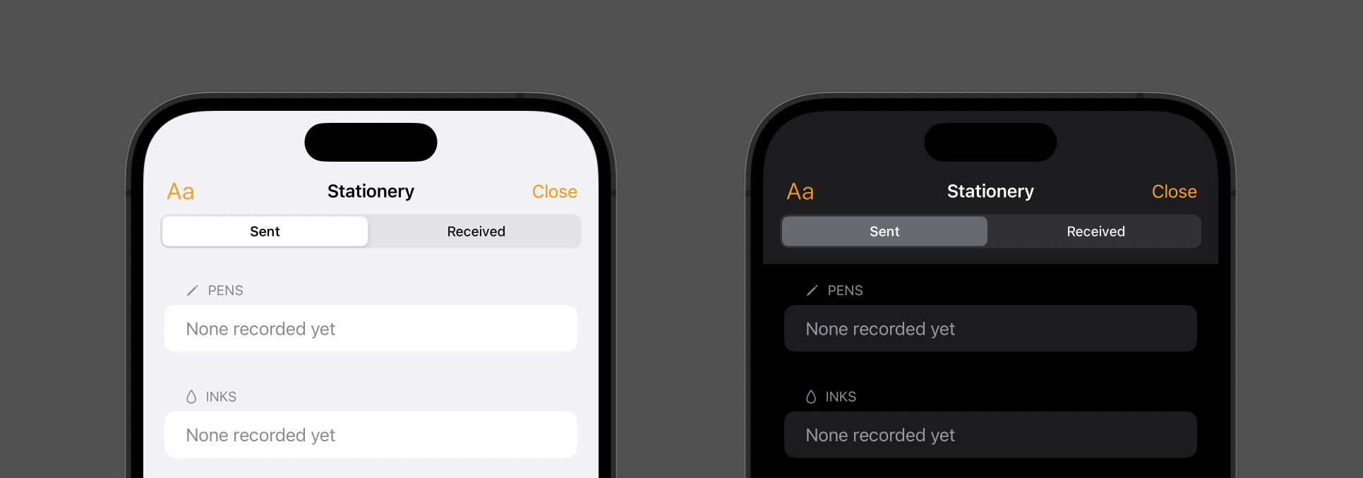
In light mode, everything was fine; but in dark mode, the background of the header and navigation toolbar wasn’t dark enough! It turns out that what I actually wanted was .systemGroupedBackground:
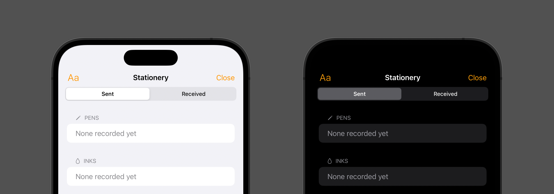
Now they match up as intended. Let this be a lesson to myself to test in both light mode and dark mode when developing anything that relies on colour!
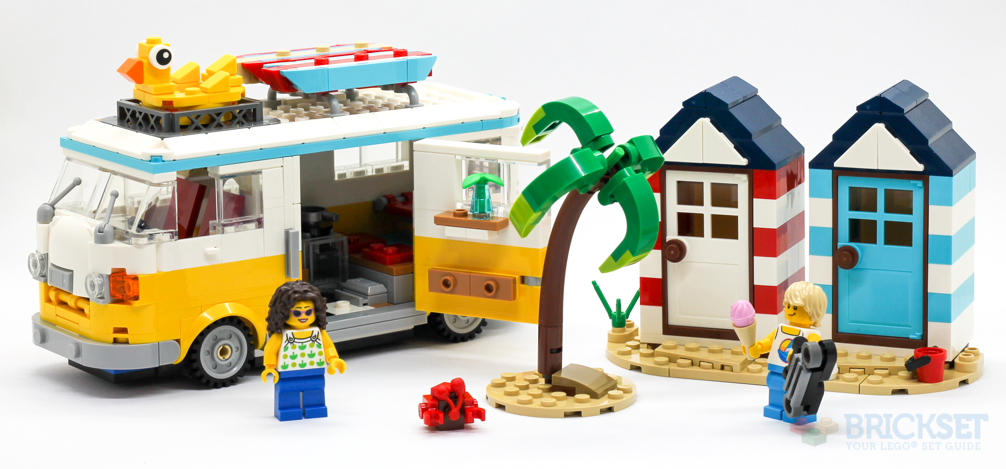
Review: 31138 Beach Camper Van
26 March 2023 • LEGO ReviewsI am just loving the Creator 3-in-1 sets that LEGO are churning out nowadays:
31138 Beach Camper Van is a perfect example of this: an excellent camper van, some lovely little beach huts, an adorable crab—and that’s all just in the primary build! Let’s take a look at the set in detail, including the two alternative models that often make the 3-in-1 sets the success they are.
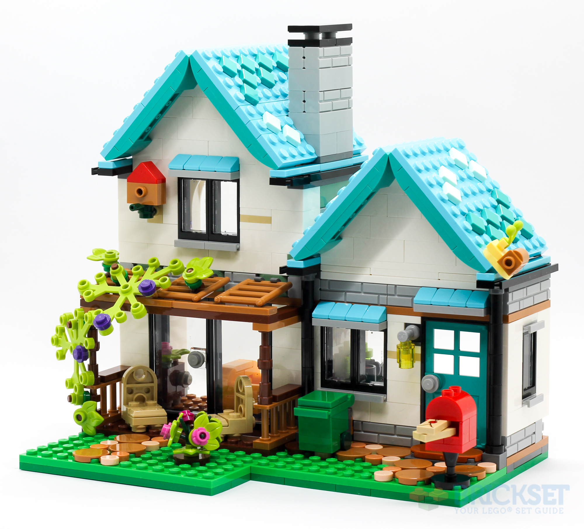
Review: 31139 Cozy House
16 March 2023 • LEGO ReviewsI love LEGO’s Creator 3-in-1 range, where every set can be built into three different designs. 31139 Cozy House is no exception, with three excellent builds, and a handful of adorable little bugs to boot!
The primary model of the set is the titular Cozy House (or “cosy”, as we’d be more likely to write here in the UK). It’s a fantastic little two-story building with pitched roofs, a delightful garden, and is full of excellent details!
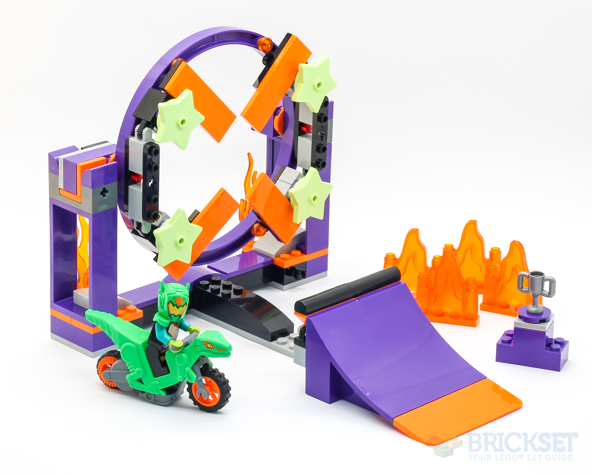
Review: 60359 Dunk Stunt Ramp Challenge
7 March 2023 • LEGO ReviewsThe latest batch of LEGO I’ve been provided to review included three City Stuntz sets, a range that I’ve not built or played with before. They come with flywheel-powered bikes and stunt arenas, and are all pretty creative and fun! The first review went up today, for 60359 Dunk Stunt Ramp Challenge:
Despite the theme entering its third year, this was my first experience of the line, and I was quite impressed! The flywheel-powered bike is a lot of fun, and it kept both my children (aged four and six) entertained for some considerable time (once they stopped fighting over whose turn it was).
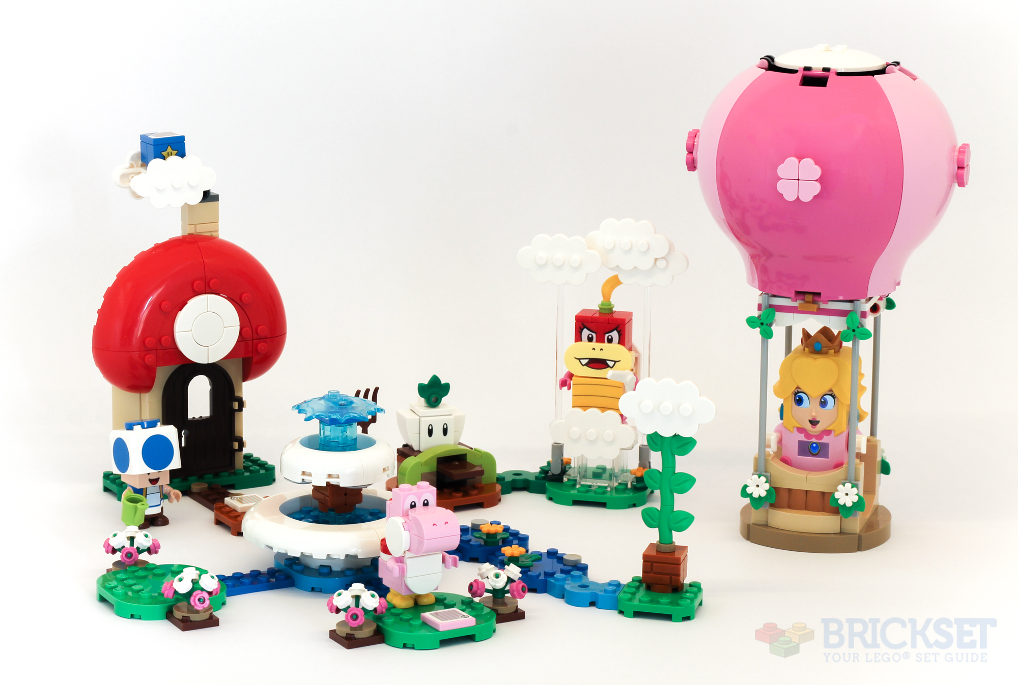
Review: 71419 Peach's Garden Balloon Ride
25 February 2023 • LEGO ReviewsPrincess Peach is back (in LEGO form) with another expansion set to the Super Mario theme. Huw over at Brickset.com asked me to take a look and see how it stacks up.
It is typical LEGO Super Mario fare: bright and colourful, with standard game mechanics, introducing a new character and recycling some old favourites.
Read the full review on Brickset.com.
Implementing a Tip Jar with Swift and SwiftUI
17 February 2023 • Development • Swift • SwiftUIPressured by friends, I recently added a tip jar to Pendulum, the pen pal tracking app I develop with my friend Alex. It’s implemented (like the rest of the app) in pure SwiftUI, and uses the newer StoreKit 2 APIs to communicate with Apple to fetch the IAP information and make purchases. This is a write of how I muddled through the process, from start to finish.
Defining the tip IAPs
The first step is to head into App Store Connect and define the IAPs for each of the tips you want to offer. In my case, I knew what I wanted the tips to be called, in ascending order of price, but not exactly what price each would be. That doesn’t matter for now, though. I had the following in mind, amusingly named after fountain pen nib sizes:
- Extra Fine Tip
- Fine Tip
- Medium Tip
- Broad Tip
- Stub Tip
To create these in App Store Connect, I headed to the In-App Purchases section under Features on the app’s App Store tab. There, I could create each tip using the plus button. The initial form has three fields:
- Type: either Consumable or Non-Consumable. I didn’t know what these are, and had to look them up: consumable IAPs are those that can be purchased multiple times by the user (for things such as in-game currency), and non-consumable IAPs can only be purchased once (for features such as unlocking a premium mode of the app). For a tip jar, I wanted the former.
- Reference Name: a name for the IAP, solely for your own use. It doesn’t appear anywhere public; for ease, I entered the names I’d chosen for the tips above.
- Product ID: a unique identifier for the IAP. I wasn’t sure how unique this was meant to be, so to be on the safe side I went for the usual Apple-style of defining them as reversed-DNS bundle identifiers. For example,
uk.co.bencardy.Pendulum.ExtraFineTip, etc.
Once created, to complete the IAP you need to define a few extra fields that aren’t present on the initial form, such as the Price Schedule (where you set the cost of the IAP, using Apple’s price tiers), and the App Store Localization, where you define how the tip appears (its name and description) in the App Store for each language. I defined only “English (U.K.)” which is all the app is offered in.
Defining the tips in Swift
StoreKit2 doesn’t have an API to fetch all the IAPs associated with an app; instead, you need to request specific Product IDs known by the app ahead of time. To this end, I decided it would be best to represent the available tips in the app with an enum, based off their unique IDs:
enum TipJar: String, CaseIterable {
    case extraFine = "uk.co.bencardy.Pendulum.ExtraFineTip"
    case fine = "uk.co.bencardy.Pendulum.FineTip"
    case medium = "uk.co.bencardy.Pendulum.MediumTip"
    case broad = "uk.co.bencardy.Pendulum.BroadTip"
    case stub = "uk.co.bencardy.Pendulum.StubTip"

    var name: String {
        switch self {
        case .extraFine:
            return "Extra Fine"
        case .fine:
            return "Fine"
        case .medium:
            return "Medium"
        case .broad:
            return "Broad"
        case .stub:
            return "Stub"
        }
    }
}
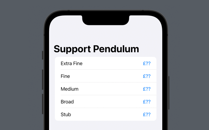
I made the enum conform to CaseIterable, meaning I can iterate over TipJar.allCases to display all available tips in the SwiftUI view. This I did inside my TipJarView, wrapping each tip in a button and displaying some placeholder information about each one:
struct TipJarView: View {
    var body: some View {
        List {
            ForEach(TipJar.allCases, id: \.self) { tip in
                Button(action: {}) {
                    HStack {
                        Text(tip.name)
                            .foregroundColor(.primary)
                        Spacer()
                        Text("£??")
                            .foregroundColor(.accentColor)
                    }
                }
            }
        }
        .navigationTitle("Support Pendulum")
    }
}
This presented a list of the available tips, with a place for me to put their prices (once known), and a button to purchase the tip (functionality yet to be completed):
Fetching IAP information with StoreKit 2
The next step was to actually fetch the prices I had defined in App Store Connect within the app, and display them. For this, I needed to use Apple’s StoreKit 2 APIs. The particular one I’m interested in here is Product.products(for:), which returns an array of Product objects for each ID passed in. I decided to add a static method to the TipJar enum to call this with all my IAP IDs, and return a mapping of [TipJar: Product] that the view could use. The new StoreKit 2 APIs are all asyncronous, so my function needed to be to:
import StoreKit

extension TipJar {
    static func fetchProducts() async -> [Self: Product] {
        do {
            let products = try await Product.products(for: Self.allCases.map { $0.rawValue })
            var results: [Self: Product] = [:]
            for product in products {
                if let type = TipJar(rawValue: product.id) {
                    results[type] = product
                }
            }
            return results
        } catch {
            storeLogger.error("Could not fetch products: \(error.localizedDescription)")
            return [:]
        }
    }
}
(I am sure there is a more concise way to compile the dictionary, but those are the kinds of Swift tricks I am not yet proficient enough in the language to be able to come up with when I need them, so a simple for loop had to suffice here.)
With this extension in place, I can add a new State variable to my view, and fetch the product information when the view is loaded:
struct TipJarView: View {
    @State private var tipJarPrices: [TipJar: Product] = [:]

    var body: some View {
        List {
            ...
        }
        .task {
            let products = await TipJar.fetchProducts()
            DispatchQueue.main.async {
                withAnimation {
                    self.tipJarPrices = products
                }
            }
        }
    }
}
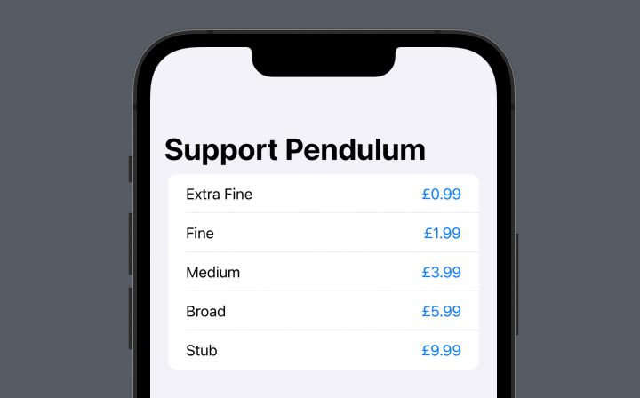
I can now use this information in the loop around the products. The Product object provides a displayPrice property, which handily returns the price of the tip in the user’s local currency, with the currency symbol:
ForEach(TipJar.allCases, id: \.self) { tip in
    Button(action: {}) {
        HStack {
            Text(tip.name)
                .foregroundColor(.primary)
            Spacer()
            if let product = tipJarPrices[tip] {
                Text(product.displayPrice)
                    .foregroundColor(.accentColor)
            }
        }
    }
}
After a brief moment with no prices available, they suddenly all fade in:
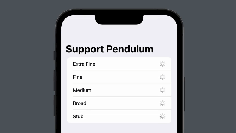
We can do better than that, though. Using another state variable, we can notify the view when the product information has been loaded, and display a progress spinner until that point. We also need to handle the case that, for some reason, the products have been fetched but a particular tip isn’t present. I chose to do so with a simple warning triangle.
struct TipJarView: View {
    @State private var tipJarPrices: [TipJar: Product] = [:]
    @State private var productsFetched: Bool = false

    var body: some View {
        List {
            ForEach(TipJar.allCases, id: \.self) { tip in
                Button(action: {}) {
                    HStack {
                        Text(tip.name)
                            .foregroundColor(.primary)
                        Spacer()
                        if let product = tipJarPrices[tip] {
                            Text(product.displayPrice)
                                .foregroundColor(.accentColor)
                        } else {
                            if productsFetched {
                                Image(systemName: "exclamationmark.triangle")
                            } else {
                                ProgressView()
                            }
                        }
                    }
                }
            }
        }
        .task {
            let products = await TipJar.fetchProducts()
            DispatchQueue.main.async {
                withAnimation {
                    self.tipJarPrices = products
                    self.productsFetched = true
                }
            }
        }
    }
}
Making a purchase
To initiate the actual purchase of the IAP, we need to call the Product’s .purchase() method. This async method returns a result indicating whether the purchase was successful or not, and a few other bits of information. As is my way, I chose to wrap this up in a method on the TipJar enum:
extension TipJar {
    func purchase(_ product: Product) async -> Bool {
        storeLogger.debug("Attempting to purchase \(self.rawValue)")
        do {
            let purchaseResult = try await product.purchase()
            switch purchaseResult {
            case .success(let verificationResult):
                storeLogger.debug("Purchase result: success")
                switch verificationResult {
                case .verified(let transaction):
                    storeLogger.debug("Purchase success result: verified")
                    await transaction.finish()
                    return true
                default:
                    storeLogger.debug("Purchase success result: unverified")
                    return false
                }
            default:
                return false
            }
        } catch {
            storeLogger.error("Could not purchase \(self.rawValue): \(error.localizedDescription)")
            return false
        }
    }
}
For ease of use in the view, I convert the result into a simple true or false for whether the purchase went through successfully. In the view, I can fire this off inside a Task in the button’s action method, and handle the response appropriately. In this case, I want to display an alert saying thank you on a successful purchase, and do nothing if it was cancelled:
struct TipJarView: View {
    ...
    @State private var showingSuccessAlert: Bool = false
    var body: some View {
        List {
            ForEach(TipJar.allCases, id: \.self) { tip in
                Button(action: {
                    storeLogger.debug("\(tip.rawValue) tapped")
                    if let product = tipJarPrices[tip] {
                        Task {
                            if await tip.purchase(product) {
                                DispatchQueue.main.async {
                                    withAnimation {
                                        showingSuccessAlert = successful
                                    }
                                }
                            }
                        }
                    }
                }) {
                    ...
                }
            }
        }
        .alert(isPresented: $showingSuccessAlert) {
            Alert(title: Text("Purchase Successful"), message: Text("Thank you for supporting Pendulum!"), dismissButton: .default(Text("🧡")))
        }
        ...
    }
}
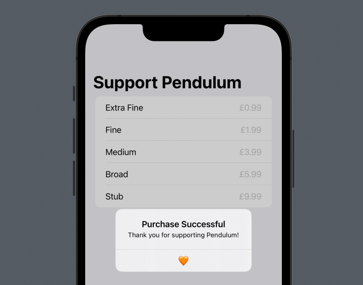
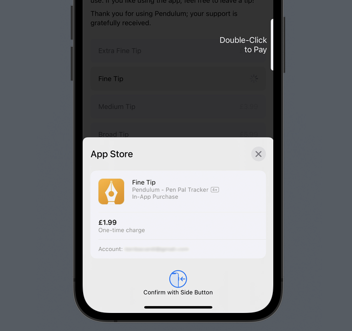
We now have a fully-functional tip jar! Users can view the list of tips, complete with pricing information in their own local currency, and tap on a tip to purchase it.
Preventing user interaction
The final niggle I wanted to fix was preventing user interaction with the tip buttons in three situations:
- while the tip information is still loading,
- if there was an error loading a particular tip, and
- while an IAP purchase is in progress.
The first two situations can be handled together: in both cases, the tipJarPrices dict has no entry for the given tip. A simple disabled modifier on the Button will prevent the user from tapping it:
struct TipJarView: View {
    ...
    var body: some View {
        List {
            ForEach(TipJar.allCases, id: \.self) { tip in
                Button(action: { ... }) {
                    ...
                }
                .disabled(tipJarPrices[tip] == nil)
            }
        }
        ...
    }
}
The latter requires us to store some information about whether a purchase is in progress or not. Again, a State variable is perfect here. We can set it when the tip is tapped, and check it later:
struct TipJarView: View {
    ...
    @State private var pendingPurchase: TipJar? = nil
    var body: some View {
        List {
            ForEach(TipJar.allCases, id: \.self) { tip in
                Button(action: {
                    guard pendingPurchase == nil else { return }
                    storeLogger.debug("\(tip.rawValue) tapped")
                    if let product = tipJarPrices[tip] {
                        withAnimation {
                            pendingPurchase = tip
                        }
                        Task {
                            let successful = await tip.purchase(product)
                            storeLogger.debug("Successful? \(successful)")
                            DispatchQueue.main.async {
                                withAnimation {
                                    showingSuccessAlert = successful
                                    pendingPurchase = nil
                                }
                            }
                        }
                    }
                }) {
                    GroupBox {
                        HStack {
                            Text("\(tip.name) Tip")
                                .fullWidth()
                            if let product = tipJarPrices[tip] {
                                if pendingPurchase == tip {
                                    ProgressView()
                                } else {
                                    Text(product.displayPrice)
                                        .foregroundColor(.accentColor)
                                }
                            } else {
                                if productsFetched {
                                    Image(systemName: "exclamationmark.triangle")
                                } else {
                                    ProgressView()
                                }
                            }
                        }
                    }
                    .foregroundColor(.primary)
                }
                .disabled(tipJarPrices[tip] == nil || pendingPurchase != nil)
            }
        }
        ...
    }
}
There’s a few parts to this code, so I’ll highlight them here:
- The
Statevariable stores whether or not a purchase is in progress, and if so, which tip is being purchased. - When a tip is tapped, we guard against making multiple concurrent purchases by immediately returning if
pendingPurchaseisn’tnil. - If there’s no purchase in progress, we update
pendingPurchasewhen a tip is tapped, and set it back tonilonce the purchase has completed. - If a purchase is pending for a given tip (
purchasePending == tip), we display a progress spinner instead of the price, so the user knows that something is still happening. - Finally, we disable the button for each tip while a purchase is in progress.
What I learned
In putting this tip jar together, I learned a number of things, not least:
- how to define IAPs in App Store Connect;
- how to fetch that IAP information using StoreKit 2, and display it in the app; and
- how to initiate IAP purchases when the user taps a button, and handle the various possible responses.
There are a number of ways we could improve upon this basic tip jar, but it’s a pretty decent start. In my own implementation in the app, I also added support for storing a history of how many of each tip the user has purchased, in order to show them the size of their “tip collection” for a little bit of whimsy (and to hopefully encourage more tips!). That’s left as an exercise for the reader; but I’m storing the information in NSUbiquitousKeyValueStore, a useful little class that automatically syncs its using iCloud.
Hopefully you’ve found some useful information in this post to inspire you to add a tip jar to your own indie apps! I’d love to hear about them: let me know on Mastodon.
SwiftUI: Equal Width Icons
2 February 2023 • Development • Swift • SwiftUIFollowing on from my previous post on SwiftUI Text alignment, I thought I’d post about another common issue I run into and how to solve it relatively simply: equal width icons. This logic applies to any series of Views you want to display equally in either height or width, but the most common place it occurs in my own code is when using SF Symbols. Each symbol has its own width, so when using them as bullets or in other situations where you want them to line up it can be infuriating.
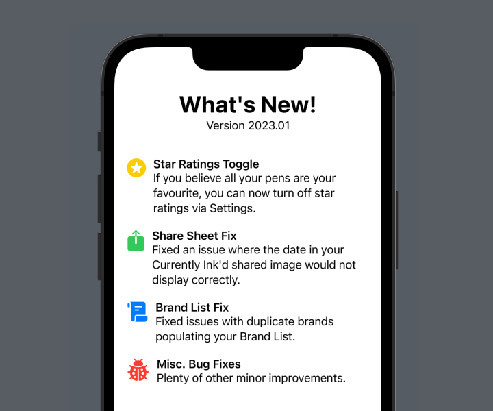
Let’s set the stage with some code. The example I’m using is the ubiquitous “What’s New” sheet, found in many of Apple’s own apps. I’ve borrowed the text and icons from the latest update to Penedex, a pen-tracking app developed by Connor Rose. Here’s the sample View:
struct EqualWidthIcons: View {
    var body: some View {
        VStack(spacing: 20) {

            VStack {
                Text("What's New!")
                    .font(.largeTitle)
                    .bold()
                Text("Version 2023.01")
            }
            .padding(.bottom)

            HStack(alignment: .top) {
                Image(systemName: "star.circle.fill")
                    .font(.title)
                    .foregroundColor(.yellow)
                VStack(alignment: .leading) {
                    Text("Star Ratings Toggle")
                        .font(.headline)
                    Text("If you believe all your pens are your favourite, you can now turn off star ratings via Settings.")
                }
                .fullWidth()
            }

            HStack(alignment: .top) {
                Image(systemName: "square.and.arrow.up.fill")
                    .font(.title)
                    .foregroundColor(.green)
                VStack(alignment: .leading) {
                    Text("Share Sheet Fix")
                        .font(.headline)
                    Text("Fixed an issue where the date in your Currently Ink'd shared image would not display correctly.")
                }
                .fullWidth()
            }

            HStack(alignment: .top) {
                Image(systemName: "scroll.fill")
                    .font(.title)
                    .foregroundColor(.blue)
                VStack(alignment: .leading) {
                    Text("Brand List Fix")
                        .font(.headline)
                    Text("Fixed issues with duplicate brands populating your Brand List.")
                }
                .fullWidth()
            }

            HStack(alignment: .top) {
                Image(systemName: "ladybug.fill")
                    .font(.title)
                    .foregroundColor(.red)
                VStack(alignment: .leading) {
                    Text("Misc. Bug Fixes")
                        .font(.headline)
                    Text("Plenty of other minor improvements.")
                }
                .fullWidth()
            }

            Spacer()
        }
        .padding()
    }
}
A series of repeated sections (don’t worry, it’ll be much neater by the end of the post), each with an icon, a title and a short summary. It makes use of the fullWidth() modifier from my previous post. This is how iOS renders it:
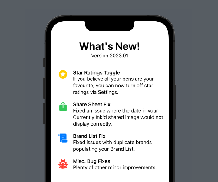
As a starter for ten, this is pretty good! But the scroll icon is wider than the previous two, and the ladybird icon even wider still. This pushes the text out to the right and it no longer lines up. We could manually define a width for the icon:
HStack(alignment: .top) {
    Image(systemName: "square.and.arrow.up.fill")
        .font(.title)
        .foregroundColor(.green)
        .frame(width: 50)
    VStack(alignment: .leading) {
        Text("Share Sheet Fix")
            .font(.headline)
        Text("Fixed an issue where the date in your Currently Ink'd shared image would not display correctly.")
    }
    .fullWidth()
}
(From now on, I’m only going to show the code for one of the four sections. The others are identical in all but the content.)
Yay, that works!
But it’s a bit of a “magic number”, and one that would likely need to be tweaked should you change the icons at a later date. Not to mention that it just won’t scale with the icon if the user adjusts the text size on their iOS device. We can do better than that.
There’s three parts to the solution. We need to:
- read the width of each icon,
- store the maximum of those widths somewhere, and
- set the width of each icon to that maximum.
Let’s take these one at a time.
Read the width of each icon
This is easily achieved using a GeometryReader. I have a bit of a love/hate relationship with this SwiftUI utility, but in this case it works very well. Appyling it as a background to the icon means it will grow to match the size of the icon’s view, and we can read the frame’s size:
Image(systemName: "square.and.arrow.up.fill")
    .font(.title)
    .foregroundColor(.green)
    .background {
        GeometryReader { geo in
            // geo.size.width is the width of the icon
        }
    }
But what we can do with that value?
Store the maximum width
In order to calculate the maximum, we need a couple of things. We need a State variable for the max icon width, and let’s give it a sensible default:
@State private var iconWidth: CGFloat = 20
And we need a way to accumulate the values read by each GeometryReader and take the maximum for our iconWidth variable. SwiftUI provides us with just the thing: a PreferenceKey. This is a strange bit of SwiftUI that allows us to combine a number of values into a single one, and store it somewhere. First, we need to define a custom PreferenceKey, with a reduce function that returns the maximum of the values it is passed. I like to do this on an extension of the main view:
private extension EqualWidthIcons {
    struct IconWidthPreferenceKey: PreferenceKey {
        static let defaultValue: CGFloat = 0
        static func reduce(value: inout CGFloat, nextValue: () -> CGFloat) {
            value = max(value, nextValue())
        }
    }
}
The code here is a little odd, but the important part is the call to max, setting the value variable to the maximum of either what it was before, or the value it has just been passed (the result of the nextValue() call).
Now we need to use this PreferenceKey in our GeometryReader. To do so, we have to call .preference(key:value:) on a View. We can place an invisible view in the GeometryReader and use it there:
Image(systemName: "square.and.arrow.up.fill")
    .font(.title)
    .foregroundColor(.green)
    .background {
        GeometryReader { geo in
            Color.clear.preference(key: EqualWidthIcons.IconWidthPreferenceKey.self, value: geo.size.width)
        }
    }
Applying this to each icon will propagate the maxiumum size up into our EqualWidthIcons.IconWidthPreferenceKey.
Set the width of each icon
Now all that’s left is to set the width of each icon to that maximum. Remember the State variable we created for it previously? We can watch for changes to the PreferenceKey and update it accordingly. I like to do this on the highest view in the hierarchy, the immediate one returned by body (in this case, that’s the outer VStack):
var body: some View {
    VStack {
        // Rest of view...
    }
    .onPreferenceChange(EqualWidthIcons.IconWidthPreferenceKey.self) { value in
        self.iconWidth = value
    }
}
Finally, update each icon to use this value as its width. It’s important that we set the frame after the GeometryReader background.
Image(systemName: "square.and.arrow.up.fill")
    .font(.title)
    .foregroundColor(.green)
    .background {
        GeometryReader { geo in
            Color.clear.preference(key: EqualWidthIcons.IconWidthPreferenceKey.self, value: geo.size.width)
        }
    }
    .frame(width: iconWidth)
And voila! Each icon has the same width, and will scale along with dynamic type as specified by the user.

Cleaning up
This works great, but we have a fair bit of duplicated code. We did already, but since we’ve added the background, GeometryReader, and frame definitions, the sections have become fairly unwieldy. It’s probably time we split it out into its own view:
struct WhatsNewSection: View {

    let icon: String
    let iconColor: Color
    let title: String
    let summary: String

    var body: some View {
        HStack(alignment: .top) {
            Image(systemName: icon)
                .font(.title)
                .foregroundColor(iconColor)
                .background {
                    GeometryReader { geo in
                        Color.clear.preference(key: EqualWidthIcons.IconWidthPreferenceKey.self, value: geo.size.width)
                    }
                }
//              How do we read the iconWidth here?
//              .frame(width: iconWidth)
            VStack(alignment: .leading) {
                Text(title)
                    .font(.headline)
                Text(summary)
            }
            .fullWidth()
        }
    }

}
This dramatically reduces the size of the original view:
struct EqualWidthIcons: View {

    @State private var iconWidth: CGFloat = 20

    var body: some View {
        VStack(spacing: 20) {

            VStack {
                Text("What's New!")
                    .font(.largeTitle)
                    .bold()
                Text("Version 2023.01")
            }
            .padding(.bottom)

            WhatsNewSection(icon: "star.circle.fill", iconColor: .yellow, title: "Star Ratings Toggle", summary: "If you believe all your pens are your favourite, you can now turn off star ratings via Settings.")
            WhatsNewSection(icon: "square.and.arrow.up.fill", iconColor: .green, title: "Share Sheet Fix", summary: "Fixed an issue where the date in your Currently Ink'd shared image would not display correctly.")
            WhatsNewSection(icon: "scroll.fill", iconColor: .blue, title: "Brand List Fix", summary: "Fixed issues with duplicate brands populating your Brand List.")
            WhatsNewSection(icon: "ladybug.fill", iconColor: .red, title: "Misc. Bug Fixes", summary: "Plenty of other minor improvements.")

            Spacer()

        }
        .padding()
        .onPreferenceChange(EqualWidthIcons.IconWidthPreferenceKey.self) { value in
            self.iconWidth = value
        }
    }
}
But you may have noticed the question in the comments in the WhatsNewSection code: where do we read iconWidth from now?
We have to pass it down as a binding from the parent view:
struct WhatsNewSection: View {
    let icon: String
    let iconColor: Color
    let title: String
    let summary: String
    @Binding var iconWidth: CGFloat
    // Rest of view...
Read it as usual to set the icon’s frame:
Image(systemName: icon)
    .font(.title)
    .foregroundColor(iconColor)
    .background {
        GeometryReader { geo in
            Color.clear.preference(key: EqualWidthIcons.IconWidthPreferenceKey.self, value: geo.size.width)
        }
    }
    .frame(width: iconWidth)
And finally, pass the binding through from the main view:
WhatsNewSection(icon: "star.circle.fill", iconColor: .yellow, title: "Star Ratings Toggle", summary: "If you believe all your pens are your favourite, you can now turn off star ratings via Settings.", iconWidth: $iconWidth)
A better alternative
For this particular situation, we can actually do away with the PreferenceKey entirely, if we switch our layout to using a Grid. Grids automatically size the width of their columns based on the widest cell within the column, which is exactly what we want. Here’s a verison of the code using Grid instead:
struct WhatsNewGridRow: View {
    let icon: String
    let iconColor: Color
    let title: String
    let summary: String

    var body: some View {
        GridRow(alignment: .top) {
            Image(systemName: icon)
                .font(.title)
                .foregroundColor(iconColor)
            VStack(alignment: .leading) {
                Text(title)
                    .font(.headline)
                Text(summary)
            }
            .fullWidth()
        }
    }

}

struct GridWidthIcons: View {
    var body: some View {
        VStack(spacing: 20) {
            VStack {
                Text("What's New!")
                    .font(.largeTitle)
                    .bold()
                Text("Version 2023.01")
            }
            .padding(.bottom)

            Grid(horizontalSpacing: 10, verticalSpacing: 10) {
                WhatsNewGridRow(icon: "star.circle.fill", iconColor: .yellow, title: "Star Ratings Toggle", summary: "If you believe all your pens are your favourite, you can now turn off star ratings via Settings.")
                WhatsNewGridRow(icon: "square.and.arrow.up.fill", iconColor: .green, title: "Share Sheet Fix", summary: "Fixed an issue where the date in your Currently Ink'd shared image would not display correctly.")
                WhatsNewGridRow(icon: "scroll.fill", iconColor: .blue, title: "Brand List Fix", summary: "Fixed issues with duplicate brands populating your Brand List.")
                WhatsNewGridRow(icon: "ladybug.fill", iconColor: .red, title: "Misc. Bug Fixes", summary: "Plenty of other minor improvements.")
            }

            Spacer()
        }
        .padding()
    }
}
The result is identical, with a little less code a lot less complexity. However, there are still some situations where you want icons or other views to match widths or heights but a grid isn’t appropriate—there may be other content between the views, for example, that you don’t want conforming to a grid—so the PreferenceKey method is still valuable to know.
The full code for both solutions can be found on Github.
SwiftUI Text Views and Alignment
25 January 2023 • Development • Swift • SwiftUIThere’s no doubting that SwiftUI makes app development fast and easy—I certainly wouldn’t have two apps on the store by now without it—but it’s not without its sharp edges and unexpected behaviours.
One of these that I ran into pretty early on is how Text views behave, particularly with regard to alignment and how it lays itself out when text spills over more than one line.
Simple Text views
Putting a bare Text view on the screen, and it’ll be centered by default:
Text("Hello, World!")

Putting a border around the Text view shows us what the boundaries of the view’s frame are, and they hug the text as tightly as possible. The Text’s frame doesn’t expand to fill all the available space; only what is necessary.
Text("Hello, World!")
    .border(.red)

If the text flows onto multiple lines, it will be left-aligned, and expand to fill the width available before wrapping the text:
Text("Lorem ipsum dolor sit amet, consectetur adipiscing elit, sed do eiusmod tempor incididunt ut labore et dolore magna aliqua.")
    .border(.red)
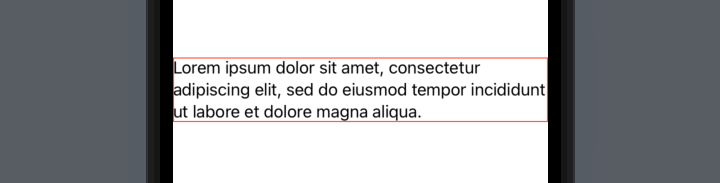
In this particular case, the frame has expanded to fill the entire width of the screen—but this is only because the second line happens to fit exactly. The frame still wants to be centered, as you can see by adjusting the paragraph slightly:
Text("Lorem ipsum dolor sit amet, consectetur adipiscing elit, sed do abore et dolore magna aliqua.")
    .border(.red)

This is often not the behaviour we want from our views! If we had multiple paragraphs, or different sections as part of a stack, they wouldn’t necessarily be aligned with each other, and it’s entirely dependent on exactly what words are in each and where the line breaks fall.
VStack(spacing: 10) {
    Text("Lorem ipsum dolor sit amet, consectetur adipiscing elit, sed do abore et dolore magna aliqua.")
    Text("Lorem ipsum dolor sit amet, sed do abore dolore magna aliqua.")
}
.padding()

With the borders on, you can clearly see what’s going on:
VStack(spacing: 10) {
    Text("Lorem ipsum dolor sit amet, consectetur adipiscing elit, sed do abore et dolore magna aliqua.")
        .border(.red)
    Text("Lorem ipsum dolor sit amet, sed do abore dolore magna aliqua.")
        .border(.green)
}
.padding()

A real world example
Let’s use a less contrived example: a settings page, with multiple different settings each with explanatory text. For lack of imagination, I’ve borrowed the settings and text from _DavidSmith’s Pedometer++ app (inspired by a recent post in his excellent Design Notes Diary series).
VStack(spacing: 10) {
    GroupBox {
        HStack {
            Text("Allow Rest Days")
                .font(.headline)
            Spacer()
        }
        Text("When enabled, activity streaks will not be broken by a single day missed after six consecutive days of reaching your goal.")
        Picker("Allow Rest Days", selection: $allowRestDays) {
            Text("Rest Days").tag(true)
            Text("Unbroken Streaks").tag(false)
        }
        .pickerStyle(.segmented)
    }
    GroupBox {
        HStack {
            Text("Wheelchair Mode")
                .font(.headline)
            Spacer()
        }
        Text("Have Pedometer++ use your Apple Watch to measure your daily wheelchair push counts rather than steps.")
        Picker("Wheelchair Mode", selection: $allowRestDays) {
            Text("Steps").tag(false)
            Text("Pushes").tag(true)
        }
        .pickerStyle(.segmented)
    }
}
.padding()
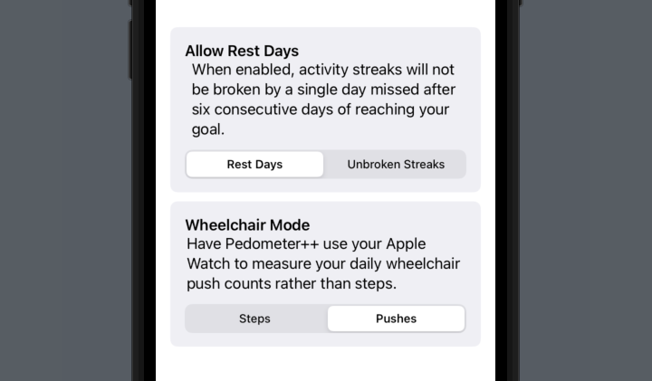
In order to left-align the settings headers, I’ve wrapped them in an HStack and followed them by a Spacer. There is a better way that we’ll come to later, but for now you can clearly see that the two explanatory paragraphs don’t align with each other, or with their surrounding content!
Adding borders in, it’s obvious why:
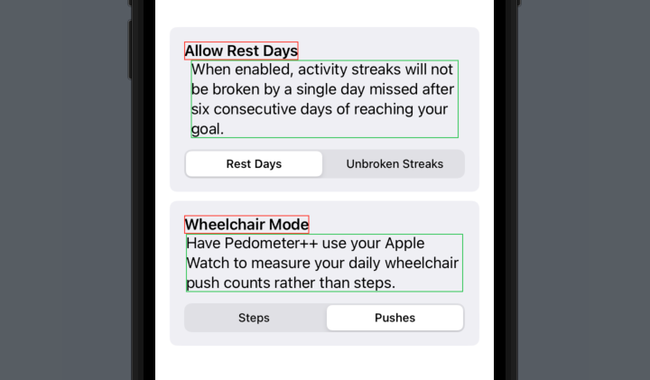
Fixing the alignment problems
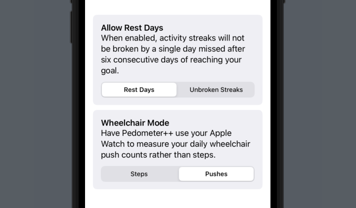
We could fix this in the same way that we pushed the titles to the left - but a better way would be to use the frame modifier on the Text views to tell them to expand to take all available space horizontally, rather than just what they require. This is a technique we can also use on the headings.
We can do this by using .frame(minWidth: 0, maxWidth: .infinity, alignment: .leading), telling SwiftUI that we want the frame to fill the entire width of its container, and align the text inside it to the left. In the code below, I’ve added it to four places: the two headers, and the two paragraphs.
VStack(spacing: 10) {
    GroupBox {
        Text("Allow Rest Days")
            .font(.headline)
            .frame(minWidth: 0, maxWidth: .infinity, alignment: .leading)
        Text("When enabled, activity streaks will not be broken by a single day missed after six consecutive days of reaching your goal.")
            .frame(minWidth: 0, maxWidth: .infinity, alignment: .leading)
        Picker("Allow Rest Days", selection: $allowRestDays) {
            Text("Rest Days").tag(true)
            Text("Unbroken Streaks").tag(false)
        }
        .pickerStyle(.segmented)
    }
    GroupBox {
        Text("Wheelchair Mode")
            .font(.headline)
            .frame(minWidth: 0, maxWidth: .infinity, alignment: .leading)
        Text("Have Pedometer++ use your Apple Watch to measure your daily wheelchair push counts rather than steps.")
            .frame(minWidth: 0, maxWidth: .infinity, alignment: .leading)
        Picker("Wheelchair Mode", selection: $allowRestDays) {
            Text("Steps").tag(false)
            Text("Pushes").tag(true)
        }
        .pickerStyle(.segmented)
    }
}
.padding()
Once again, putting the borders back in, it’s clear what’s now going on:
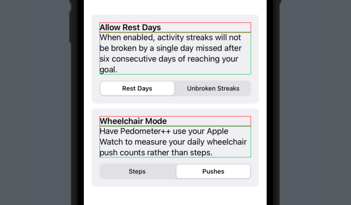
A brief note about the way
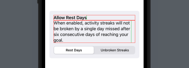
alignment:works within theframemodifier: it is not for aligning the text, it is for aligning the view within the frame. When we say.frame(minWidth: 0, maxWidth: .infinity, alignment: .leading), despite what it looks like, we’re not actually asking SwiftUI to change the size of theTextview—instead, we’re asking SwiftUI to place that view within a frame that takes up the specified space, and place it at the left of the space. If we put a border around theTextview before the frame modifier (green), and another after (red), we can see what SwiftUI is doing under the hood:
Text("Allow Rest Days")
    .font(.headline)
    .border(.green)
    .frame(minWidth: 0, maxWidth: .infinity, alignment: .leading)
    .border(.red)
Text("When enabled, activity streaks will not be broken by a single day missed after six consecutive days of reaching your goal.")
    .border(.green)
    .frame(minWidth: 0, maxWidth: .infinity, alignment: .leading)
    .border(.red)
A neat solution
In fact, this is such a common thing I want to do to Text views within my apps, that I’ve written a small view modifier to handle it. Typing .frame(minWidth: 0, maxWidth: .infinity, alignment: .leading) in so many places is a pain in the backside.
struct FullWidthText: ViewModifier {

    var alignment: TextAlignment = .leading

    var frameAlignment: Alignment {
        switch alignment {
        case .leading:
            return .leading
        case .trailing:
            return .trailing
        case .center:
            return .center
        }
    }

    func body(content: Content) -> some View {
        content
            .multilineTextAlignment(alignment)
            .frame(minWidth: 0, maxWidth: .infinity, alignment: frameAlignment)
    }
}

extension View {
    func fullWidth(alignment: TextAlignment = .leading) -> some View {
        modifier(FullWidthText(alignment: alignment))
    }
}
Now we can clean up our previous code, producing the same result but with a much neater and easier to remember view modifier:
VStack(spacing: 10) {
    GroupBox {
        Text("Allow Rest Days")
            .font(.headline)
            .fullWidth()
        Text("When enabled, activity streaks will not be broken by a single day missed after six consecutive days of reaching your goal.")
            .fullWidth()
        Picker("Allow Rest Days", selection: $allowRestDays) {
            Text("Rest Days").tag(true)
            Text("Unbroken Streaks").tag(false)
        }
        .pickerStyle(.segmented)
    }
    GroupBox {
        Text("Wheelchair Mode")
            .font(.headline)
            .fullWidth()
        Text("Have Pedometer++ use your Apple Watch to measure your daily wheelchair push counts rather than steps.")
            .fullWidth()
        Picker("Wheelchair Mode", selection: $wheelchairMode) {
            Text("Steps").tag(false)
            Text("Pushes").tag(true)
        }
        .pickerStyle(.segmented)
    }
}
.padding()
As you may have noticed, it also supports providing the other TextAlignment options for multiline text, passed to the .fullWidth(alignment:) videw modifier: .leading (the default), .centered, and .trailing.
Hopefully this can be of some use to you and help clear up some of the oddities surrounding the layout of text in SwiftUI! If you do find it helpful, I’d love for you to let me know.