SwiftUI Text Views and Alignment
25 January 2023 • Development • Swift • SwiftUIThere’s no doubting that SwiftUI makes app development fast and easy—I certainly wouldn’t have two apps on the store by now without it—but it’s not without its sharp edges and unexpected behaviours.
One of these that I ran into pretty early on is how Text views behave, particularly with regard to alignment and how it lays itself out when text spills over more than one line.
Simple Text views
Putting a bare Text view on the screen, and it’ll be centered by default:
Text("Hello, World!")

Putting a border around the Text view shows us what the boundaries of the view’s frame are, and they hug the text as tightly as possible. The Text’s frame doesn’t expand to fill all the available space; only what is necessary.
Text("Hello, World!")
    .border(.red)

If the text flows onto multiple lines, it will be left-aligned, and expand to fill the width available before wrapping the text:
Text("Lorem ipsum dolor sit amet, consectetur adipiscing elit, sed do eiusmod tempor incididunt ut labore et dolore magna aliqua.")
    .border(.red)
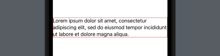
In this particular case, the frame has expanded to fill the entire width of the screen—but this is only because the second line happens to fit exactly. The frame still wants to be centered, as you can see by adjusting the paragraph slightly:
Text("Lorem ipsum dolor sit amet, consectetur adipiscing elit, sed do abore et dolore magna aliqua.")
    .border(.red)

This is often not the behaviour we want from our views! If we had multiple paragraphs, or different sections as part of a stack, they wouldn’t necessarily be aligned with each other, and it’s entirely dependent on exactly what words are in each and where the line breaks fall.
VStack(spacing: 10) {
    Text("Lorem ipsum dolor sit amet, consectetur adipiscing elit, sed do abore et dolore magna aliqua.")
    Text("Lorem ipsum dolor sit amet, sed do abore dolore magna aliqua.")
}
.padding()

With the borders on, you can clearly see what’s going on:
VStack(spacing: 10) {
    Text("Lorem ipsum dolor sit amet, consectetur adipiscing elit, sed do abore et dolore magna aliqua.")
        .border(.red)
    Text("Lorem ipsum dolor sit amet, sed do abore dolore magna aliqua.")
        .border(.green)
}
.padding()

A real world example
Let’s use a less contrived example: a settings page, with multiple different settings each with explanatory text. For lack of imagination, I’ve borrowed the settings and text from _DavidSmith’s Pedometer++ app (inspired by a recent post in his excellent Design Notes Diary series).
VStack(spacing: 10) {
    GroupBox {
        HStack {
            Text("Allow Rest Days")
                .font(.headline)
            Spacer()
        }
        Text("When enabled, activity streaks will not be broken by a single day missed after six consecutive days of reaching your goal.")
        Picker("Allow Rest Days", selection: $allowRestDays) {
            Text("Rest Days").tag(true)
            Text("Unbroken Streaks").tag(false)
        }
        .pickerStyle(.segmented)
    }
    GroupBox {
        HStack {
            Text("Wheelchair Mode")
                .font(.headline)
            Spacer()
        }
        Text("Have Pedometer++ use your Apple Watch to measure your daily wheelchair push counts rather than steps.")
        Picker("Wheelchair Mode", selection: $allowRestDays) {
            Text("Steps").tag(false)
            Text("Pushes").tag(true)
        }
        .pickerStyle(.segmented)
    }
}
.padding()
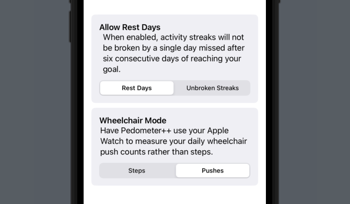
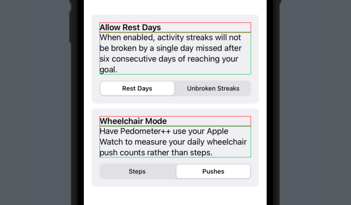
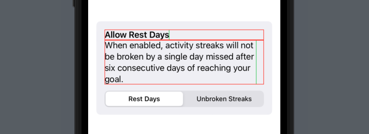
In order to left-align the settings headers, I’ve wrapped them in an HStack and followed them by a Spacer. There is a better way that we’ll come to later, but for now you can clearly see that the two explanatory paragraphs don’t align with each other, or with their surrounding content!
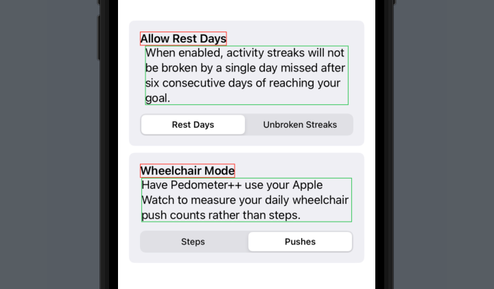
Adding borders in, it’s obvious why:
Fixing the alignment problems
We could fix this in the same way that we pushed the titles to the left - but a better way would be to use the frame modifier on the Text views to tell them to expand to take all available space horizontally, rather than just what they require. This is a technique we can also use on the headings.
We can do this by using .frame(minWidth: 0, maxWidth: .infinity, alignment: .leading), telling SwiftUI that we want the frame to fill the entire width of its container, and align the text inside it to the left. In the code below, I’ve added it to four places: the two headers, and the two paragraphs.
VStack(spacing: 10) {
    GroupBox {
        Text("Allow Rest Days")
            .font(.headline)
            .frame(minWidth: 0, maxWidth: .infinity, alignment: .leading)
        Text("When enabled, activity streaks will not be broken by a single day missed after six consecutive days of reaching your goal.")
            .frame(minWidth: 0, maxWidth: .infinity, alignment: .leading)
        Picker("Allow Rest Days", selection: $allowRestDays) {
            Text("Rest Days").tag(true)
            Text("Unbroken Streaks").tag(false)
        }
        .pickerStyle(.segmented)
    }
    GroupBox {
        Text("Wheelchair Mode")
            .font(.headline)
            .frame(minWidth: 0, maxWidth: .infinity, alignment: .leading)
        Text("Have Pedometer++ use your Apple Watch to measure your daily wheelchair push counts rather than steps.")
            .frame(minWidth: 0, maxWidth: .infinity, alignment: .leading)
        Picker("Wheelchair Mode", selection: $allowRestDays) {
            Text("Steps").tag(false)
            Text("Pushes").tag(true)
        }
        .pickerStyle(.segmented)
    }
}
.padding()
Once again, putting the borders back in, it’s clear what’s now going on:
A brief note about the way
alignment:works within theframemodifier: it is not for aligning the text, it is for aligning the view within the frame. When we say.frame(minWidth: 0, maxWidth: .infinity, alignment: .leading), despite what it looks like, we’re not actually asking SwiftUI to change the size of theTextview—instead, we’re asking SwiftUI to place that view within a frame that takes up the specified space, and place it at the left of the space. If we put a border around theTextview before the frame modifier (green), and another after (red), we can see what SwiftUI is doing under the hood:
Text("Allow Rest Days")
    .font(.headline)
    .border(.green)
    .frame(minWidth: 0, maxWidth: .infinity, alignment: .leading)
    .border(.red)
Text("When enabled, activity streaks will not be broken by a single day missed after six consecutive days of reaching your goal.")
    .border(.green)
    .frame(minWidth: 0, maxWidth: .infinity, alignment: .leading)
    .border(.red)
A neat solution
In fact, this is such a common thing I want to do to Text views within my apps, that I’ve written a small view modifier to handle it. Typing .frame(minWidth: 0, maxWidth: .infinity, alignment: .leading) in so many places is a pain in the backside.
struct FullWidthText: ViewModifier {

    var alignment: TextAlignment = .leading

    var frameAlignment: Alignment {
        switch alignment {
        case .leading:
            return .leading
        case .trailing:
            return .trailing
        case .center:
            return .center
        }
    }

    func body(content: Content) -> some View {
        content
            .multilineTextAlignment(alignment)
            .frame(minWidth: 0, maxWidth: .infinity, alignment: frameAlignment)
    }
}

extension View {
    func fullWidth(alignment: TextAlignment = .leading) -> some View {
        modifier(FullWidthText(alignment: alignment))
    }
}
Now we can clean up our previous code, producing the same result but with a much neater and easier to remember view modifier:
VStack(spacing: 10) {
    GroupBox {
        Text("Allow Rest Days")
            .font(.headline)
            .fullWidth()
        Text("When enabled, activity streaks will not be broken by a single day missed after six consecutive days of reaching your goal.")
            .fullWidth()
        Picker("Allow Rest Days", selection: $allowRestDays) {
            Text("Rest Days").tag(true)
            Text("Unbroken Streaks").tag(false)
        }
        .pickerStyle(.segmented)
    }
    GroupBox {
        Text("Wheelchair Mode")
            .font(.headline)
            .fullWidth()
        Text("Have Pedometer++ use your Apple Watch to measure your daily wheelchair push counts rather than steps.")
            .fullWidth()
        Picker("Wheelchair Mode", selection: $wheelchairMode) {
            Text("Steps").tag(false)
            Text("Pushes").tag(true)
        }
        .pickerStyle(.segmented)
    }
}
.padding()
As you may have noticed, it also supports providing the other TextAlignment options for multiline text, passed to the .fullWidth(alignment:) videw modifier: .leading (the default), .centered, and .trailing.
Hopefully this can be of some use to you and help clear up some of the oddities surrounding the layout of text in SwiftUI! If you do find it helpful, I’d love for you to let me know.