Anatomy of a Widget
12 August 2023 • Development • Swift • SwiftUII have long been a little confused by how widgets work, from a development perspective, in iOS apps. There are a number of moving parts that all have to work together just so to make the widget appear how you want, with the data you want, when you want. This post is my attempt to break it down into each part, in the order they need to be defined so the app still compiles after each step, with my understanding of what they’re for and what they do.
The major caveat here is: I still do not understand widgets, or really know how to build them properly. Nor do I understand interactive widgets that come in with iOS 17. But, hopefully, my knowledge will increase and I can update this post as I learn more! Please do not hesitate to let me know about anything I write here that’s misleading or factually incorrect.
The Timeline Entry
Widgets are a series of static SwiftUI views, rendered on a timeline into the future. When the system reaches the end of the timeline, or at some point determined by your app or widget configuration, the app extension is asked for another timeline to render.
Each item in this timeline is a timeline entry, which is simply a struct conforming to TimelineEntry. This struct needs to hold all the data your widget needs to know in order to render correctly. The date property is mandatory (specified by the TimelineEntry protocol), but all other properties are up to you. For example, a widget that simply renders some text may need a timeline entry such as the following:
struct MyWidgetEntry: TimelineEntry {
    let date: Date
    let text: String
}
The Timeline Provider
This is the part of the widget that is responsible for providing each timeline when iOS asks for one, and needs to be a struct conforming to TimelineProvider. Apple’s documentation is pretty good here. There are three required methods that need to be implemented:
- The
placeholdermethod must return, as quickly as possible, a single timeline entry for use in placeholder views (such as when the user taps the your app in the Add Widget gallery). - The
getSnapshotmethod also needs to provide a single timeline entry, but gets a bit more time to fetch real data, and can be used to make the widget previews in the gallery more representative of the actual widget once added. - Finally, the
getTimelinemethod must provide aTimelineobject with a list of dated entries stretching into the future, and a policy of when the timeline should be refreshed.
struct MyTimelineProvider: TimelineProvider {
    func placeholder(in context: Context) -> MyWidgetEntry {
        WidgetEntry(date: Date(), text: "Placeholder")
    }

    func getSnapshot(in context: Context, completion: @escaping (MyWidgetEntry) -> ()) {
        let entry = MyWidgetEntry(date: Date(), text: "Snapshot")
        completion(entry)
    }

    func getTimeline(in context: Context, completion: @escaping (Timeline<MyWidgetEntry>) -> ()) {
        var entries: [MyWidgetEntry] = []

        // Generate a timeline consisting of five entries an hour apart, starting from the current date.
        let currentDate = Date()
        for hourOffset in 0 ..< 5 {
            let entryDate = Calendar.current.date(byAdding: .hour, value: hourOffset, to: currentDate)!
            let entry = MyWidgetEntry(date: entryDate, emoji: "In a timeline! \(hourOffset)")
            entries.append(entry)
        }

        let timeline = Timeline(entries: entries, policy: .atEnd)
        completion(timeline)
    }
}
The most common refresh policy is .atEnd, which will instruct iOS to ask for a new timeline once this one is complete. The widget will be rendered with each timeline entry at its specified date.
The Widget’s View
This is the core of the display of the widget, a SwiftUI view that takes the timeline entry as a parameter and renders the data as necessary. It doesn’t have to be a separate View (it could be rendered as part of the widget itself, see below), but it’s much neater this way.
struct MyWidgetView : View {
    var entry: MyWidgetEntry

    var body: some View {
        VStack {
            Text(entry.date, style: .time)
            Text(entry.text)
        }
    }
}
There’s nothing magic here.
The Widget Itself
Each widget is a struct that conforms to Widget, which looks similar to a SwiftUI View with a couple of extra options:
- You must provide a
kindString constant, with a unique (to the app) identifier for the type of widget. - You need to return a
WidgetConfigurationobject frombody, and provide theconfigurationDisplayName(_)anddescription(_)view modifiers. The simplest option here is aStaticConfiguration(well, I haven’t learned about any others yet).
struct MyWidget: Widget {
    let kind: String = "MyWidget"

    var body: some WidgetConfiguration {
        StaticConfiguration(kind: kind, provider: MyTimelineProvider()) { entry in
            if #available(iOS 17.0, *) {
                MyWidgetView(entry: entry)
                    .containerBackground(.fill.tertiary, for: .widget)
            } else {
                MyWidgetView(entry: entry)
                    .padding()
                    .background()
            }
        }
        .configurationDisplayName("My Widget")
        .description("This is an example widget.")
        .supportedFamilies([.systemSmall, .systemMedium, .systemLarge])
    }
}
The StaticConfiguration struct takes the widget’s kind string, an instance of your timeline provider, and a closure to call with each entry in the timeline. The closure should return the SwiftUI view configured/rendered for that particular entry.
You can also provide the supportedFamilies view modifier with a list of the different types of widget sizes that this widget supports, including Lock Screen widgets. You can use the environment variable .widgetFamily inside the view to change the layout of the view based on what size widget is currently displayed:
@Environment(\.widgetFamily) var widgetFamily
Apps built using the iOS 17 SDK require all widgets to use the new containerBackground modifier, which automatically handles padding.
Previewing Widgets
Widgets are simple to use with SwiftUI previews: you can either preview the widget View by itself, passing a static timeline entry, such as using the pre-Xcode 15 preview provider:
struct MyWidgetView_Previews: PreviewProvider {
    static var previews: some View {
        MyWidgetView(entry: MyWidgetEntry(date: .now, text: "Text"))
            .previewContext(WidgetPreviewContext(family: .systemSmall))
    }
}
Or you can use Xcode 15’s new #Preview macro, with the version specifically designed for widgets, that accepts a timeline of entries. This time you pass it the widget itself, not the view the widget renders:
#Preview(as: .systemSmall) {
    MyWidget()
} timeline: {
    MyWidgetEntry(date: .now, text: "Text 1")
    MyWidgetEntry(date: .now, text: "Text 2")
}
If you’ve reached this far, then you’ve done enough to design the widget and how it populates its timeline into the future, but we still need to tell iOS about it. This is done with one last struct.
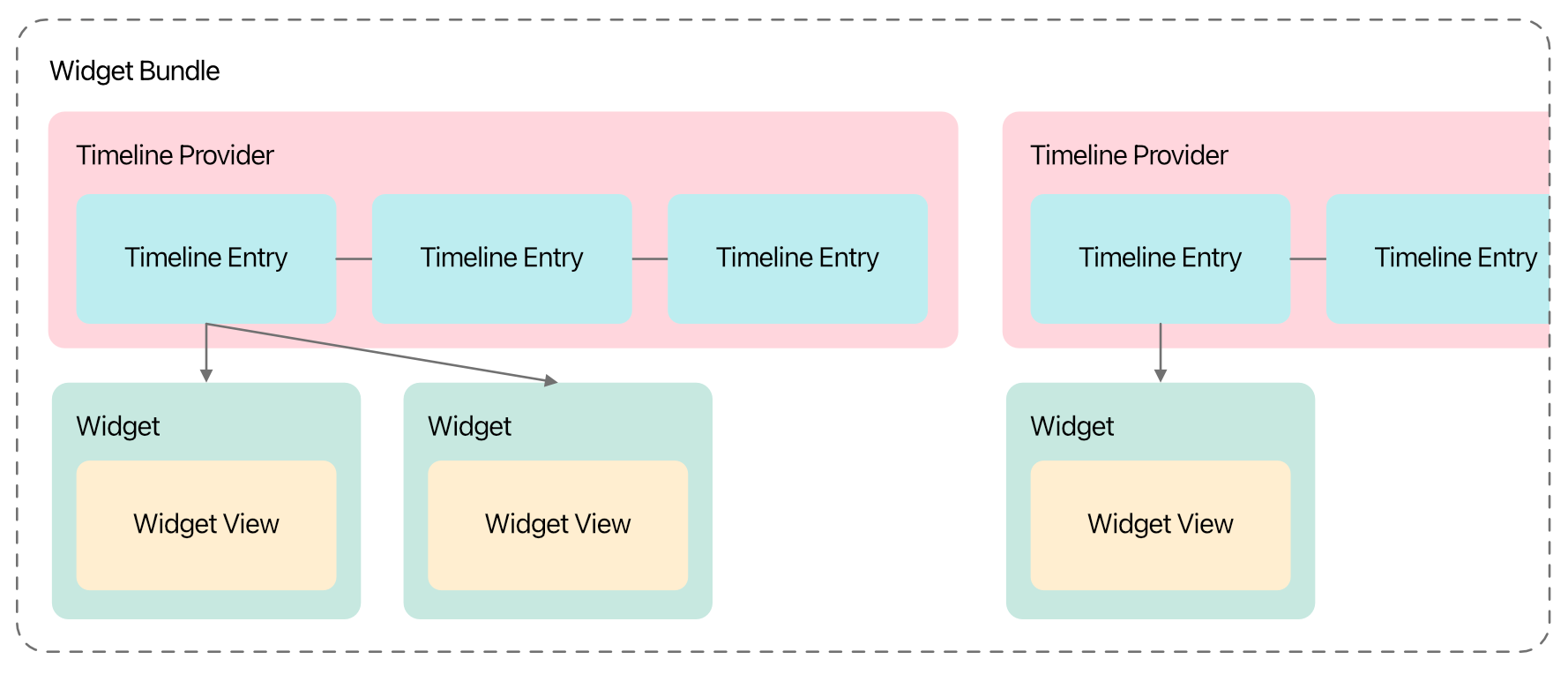
The Widget Bundle
To tell iOS about the available widgets in your app, you need a single widget bundle defined in the widget extension, which is a struct conforming to WidgetBundle, and marked with the @main wrapper. Similar to SwiftUI views, this requires one computed parameter, body, but this time is of type some Widget:
@main
struct MyWidgets: WidgetBundle {
    var body: some Widget {
        MyWidget()
    }
}
Multiple different widgets can be returned, just put each on a new line within the body. You can also do some logic here, such as if #available checks to limit certain widgets to particular iOS versions, etc.
If you have multiple widgets that need the same data, you can reuse the same Timeline Entry and Timeline Provider in multiple Widget structs.
With that, your app should be able to provide one or more widgets to the user, and control what sizes they are available in. However, you can’t yet provide options for the user to pick from, allowing them to “edit” the widget. I’ll write up what I know about that in another post, soon!